Rydo is Australia’s #1 taxi app. Trusted taxi company in Australia, that drives you anywhere in the country.
Introduction
When I joined Innovent, our team was already developing Rydo Web Application to manage the day-to-day business process of GM Cabs. I had an opportunity to work with the team to build the web application and make it usable.
Initially, the mobile app was developed by some other companies. So I convinced my boss and client that we can do better than what the current version is.
The Challenge
Although the mobile application was already built, I started from scratch. The initial goal was to do research the design pattern on how other applications like uber, ola, Lyft, ofo, LimeBike, and more had in common to let users first interact with the app.
So the main challenge was to improve the user experience flow of the application and the sexiness of the app itself. Additionally, there was no design system in place.

“It feels like they’re cheering us on. We’re up against big competitors, and we’re new to bookings and apps. The team is always asking questions about what’s happening in the industry and using the answers to make suggestions. It’s obvious to me that they have a personal attachment to Rydo. It’s not just a project they’ll walk away from.”
— Nickolas Mikhael
CEO, Rydo
The Solution
I started doing few research and found that users are using the app but however, they were frustrated of using the mobile app. So, I decided to do some UX research and improve collaboratively on the User experience of the dashboard and the mobile app.
We found out that the information on the dashboard was:
- Disjointed information – In the dashboard related information was scattered across several tabs and panels, making it difficult to correlate metrics with each other for a comprehensive understanding of app usage
- Cramped layout – Inadequate space around blocks of information screens overloaded with superfluous information
- No data visualizations in dashboard – missing labels, clickable areas not evident, and crowded charts
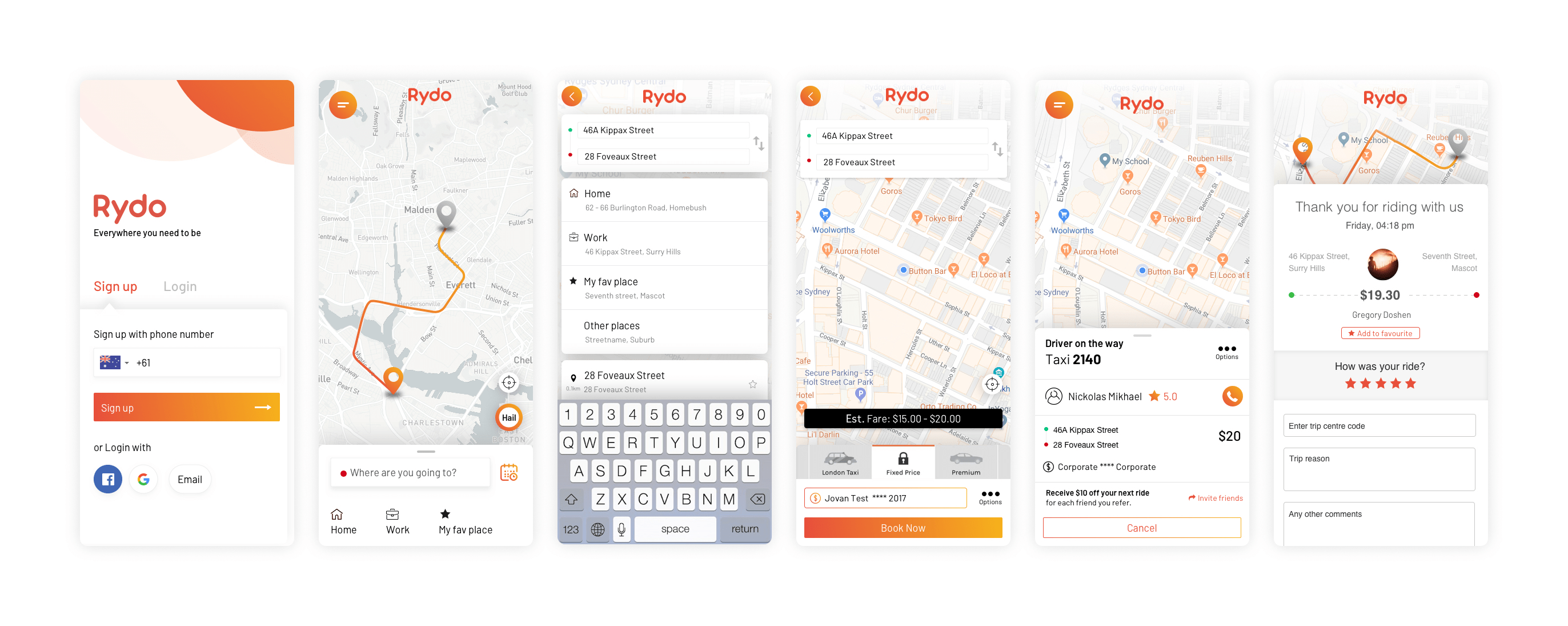
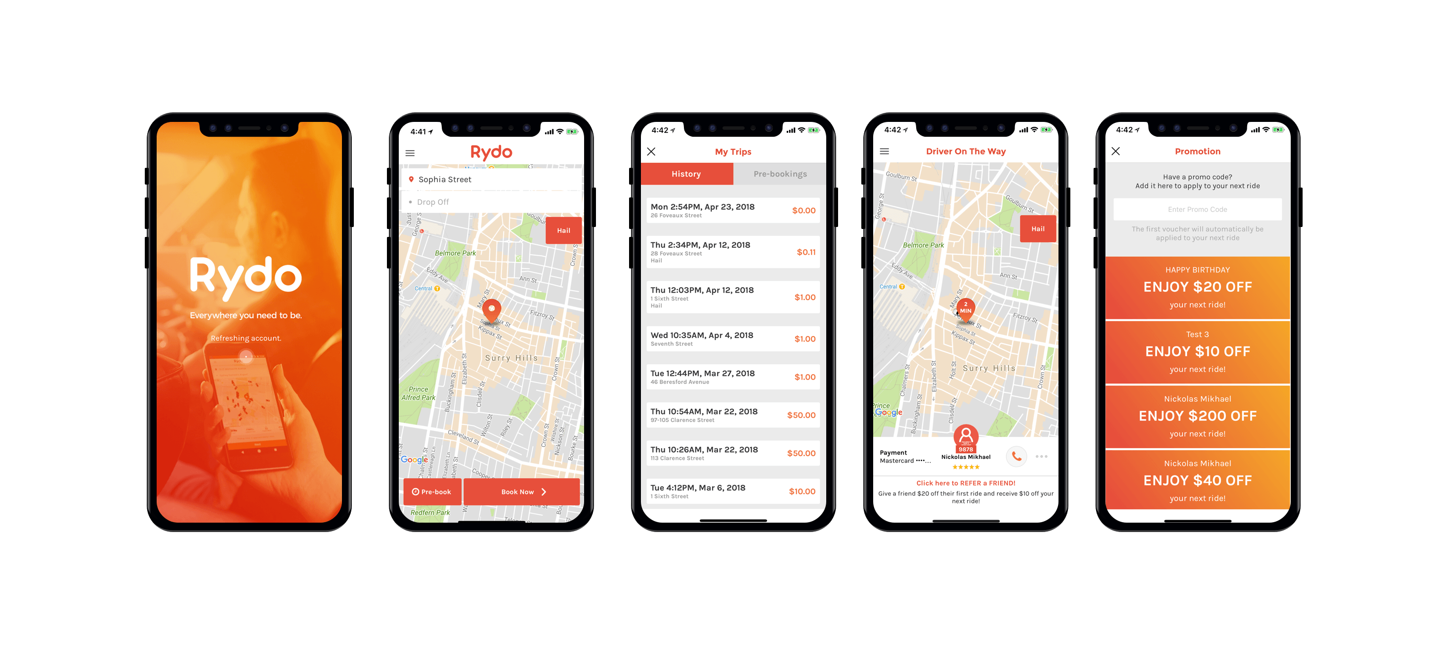
In the mobile app,
- The UI of the app wasn’t sexy as other apps.
- The navigation flow and user interaction flow wasn’t intuitive
- No place to add favorites
- Hard to user mobile app with one hand.
So my ultimate goal was to create a simple yet sexy mobile app experience to help improve the usability of the apps.


The final outcome
The final output was so outstanding that everyone loved it. Established Design system and went all around the marketing, development and product team. Marketing team felt that it was easier now with the design system in place.
% Customer Satisfaction
% App Usage Growth
increased in bookings