UXCam enables product teams to improve the end-user experience of their mobile applications by recording, analyzing, and visualizing user interactions.
Introduction
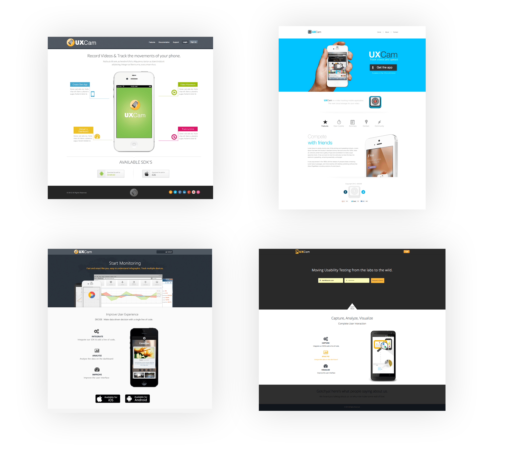
I started working in UXCam project in 2012 when the founders came up with the idea for UXCam while working on other apps and conducting a high volume of tests in a usability lab. But the equipment and time needed to gather qualitative data made the process increasingly expensive and inefficient. They decided to create a tool for developers to quickly and easily get end-user experience insights on a large scale. So, they approached me to design few versions of the new project with just a concept. I then started to design few homepage iterations.
I was also a sole full-stack designer and frontend developer doing all the graphics, web and front-end development. Slowly, UXCam started to take its own shape by researching many other similar analytic tools like Google Analytics, Mixpanel, Countly, Geckoboard and so on. UXCam quickly gained traction, growing into a platform for cross-functional collaboration between developers and product managers.

The Challenge
We started from scratch, where founders took the idea from lab-based testing to the world where you can analyze, visualize and improve the mobile user experience. No one has any idea of what the product would look like. I still remember the question I asked my CEO “So how should the dashboard look like”? He simply said, “I don’t know, haha”. Moreover, the challenge was to design a user centric dashboard where our customer can see their user’s session data at a glance.
The most challenging part while designing the first dashboard was to align the user details and their session data for our customer to understand in a meaningful way. Technically, also the challenge was, to simulate the direction of mobile movements as well. Since CSS3 was very new at that time, it was really tough to make the 3D rotation, however, we concluded using Javascript for that.
The challenge was to design a user centric dashboard where our customer can see their user’s session data at a glance.

The Solution
We started doing few research and found that users are pretty impressed with the product but however, they were frustrated of using the dashboard. So, we decided to do some UX research and improve collaboratively on the User experience of the dashboard.
We found out that the information on the dashboard was:
- Disjointed information – related information was scattered across several tabs and panels, making it difficult to correlate metrics with each other for a comprehensive understanding of app usage
- Confusing information architecture – primary levels of navigation were indistinguishable from secondary levels in the sidebar menu
- Cramped layout – inadequate space around blocks of information, screens overloaded with superfluous information
- Unclear data visualizations – missing labels, clickable areas not evident, and crowded charts
So our ultimate goal was to create a simple yet powerful dashboard experience to help product teams improve the usability of their apps.
User Persona and Customer experience map
Success for customers meant a better end-user experience for their apps, with fewer bugs and improved performance in key business metrics (user acquisition, engagement, or retention). The core workflow for success involves 4 steps, summarized by the experience map below:

The Design Solution

Journey to 500 Startups
After winning customers heart and the continuous improvement of the dashboard, we applied for the 500 Startups Incubator program. We got selected and presented the whole new experience to the investors and audiences at 500 Startups Batch 10 Demo Day in 2014. Techcrunch also listed UXCam as one of their favorite product demos from the event.

Improving UX over time
Ranging from small startups to enterprise clients has signed up to the platform and we continued doing User Research further. We already gathered lots of data to analyze and also feedbacks from the 500 startups event. Analyzing all those data, I found out that:
- The graph doesn’t make sense in UX analyzing platform.
- Filtering, analyzing, visualizing the session data was too difficult.
- Qualitative data VS Quantitative data
- Improve UX of the video player with gestures and timeline
- Customers wanted the even more easy way to visualize their data.
Based on what I found, I worked on from the strategy in building up the team, feedback, and the roadmap to making the platform more robust.
- The most important thing about the UXCam is just Visualizing the data of the app into two groups.
- Playing Video
- User performance data.
- Before playing video, we shall group users and session related information more closely together so that it would make more sense.
- Filtering should be done where the customer can see all the user/session related information.
- The customer should be able to view session video instantly of the related session data.
- Visualization on heatmap should have better key data from the app so that user can easily get enough insight at a glance.
The final outcome
The final output was so outstanding that every customer loved it and always left us their feedback to add the data which were missing. Since then we had a stable version of the platform and we kept on adding more features.
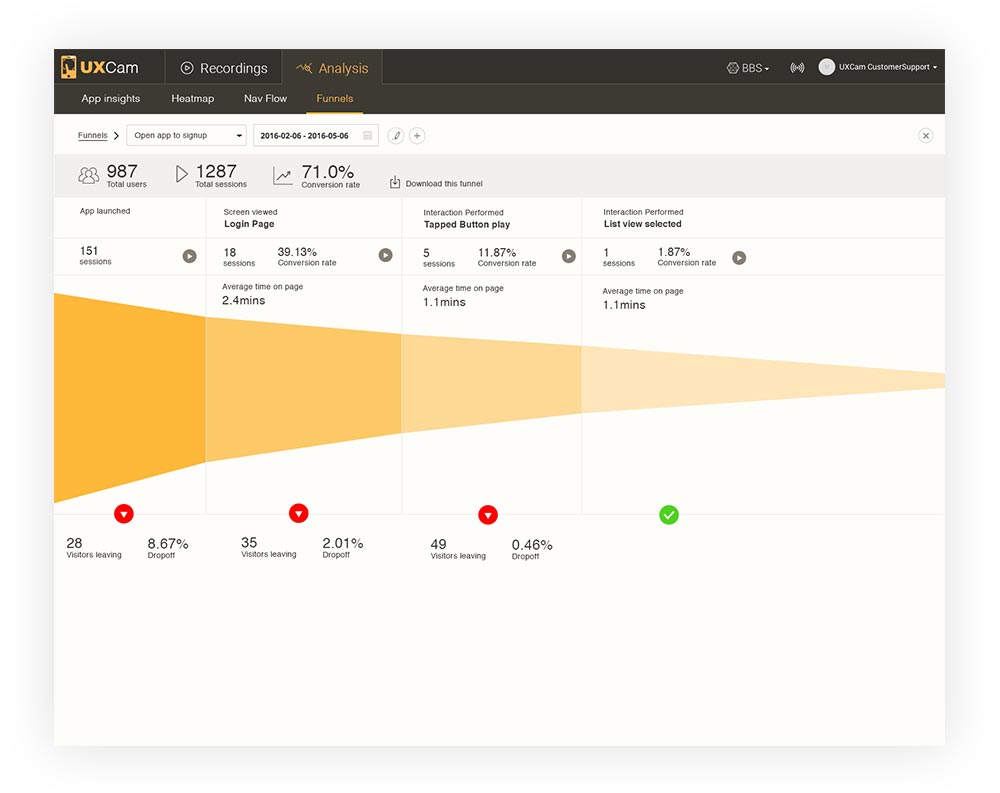
Later we also added navigational flow and funnel analysis which were also a key data in analyzing the user experience of the mobile apps.


